Merch Booth Rental
Merch Booth Layout: Shelving, Sightlines and Display Design
Whether people stop at your merch booth is decided by layout, not product. Here is how to build the layout.
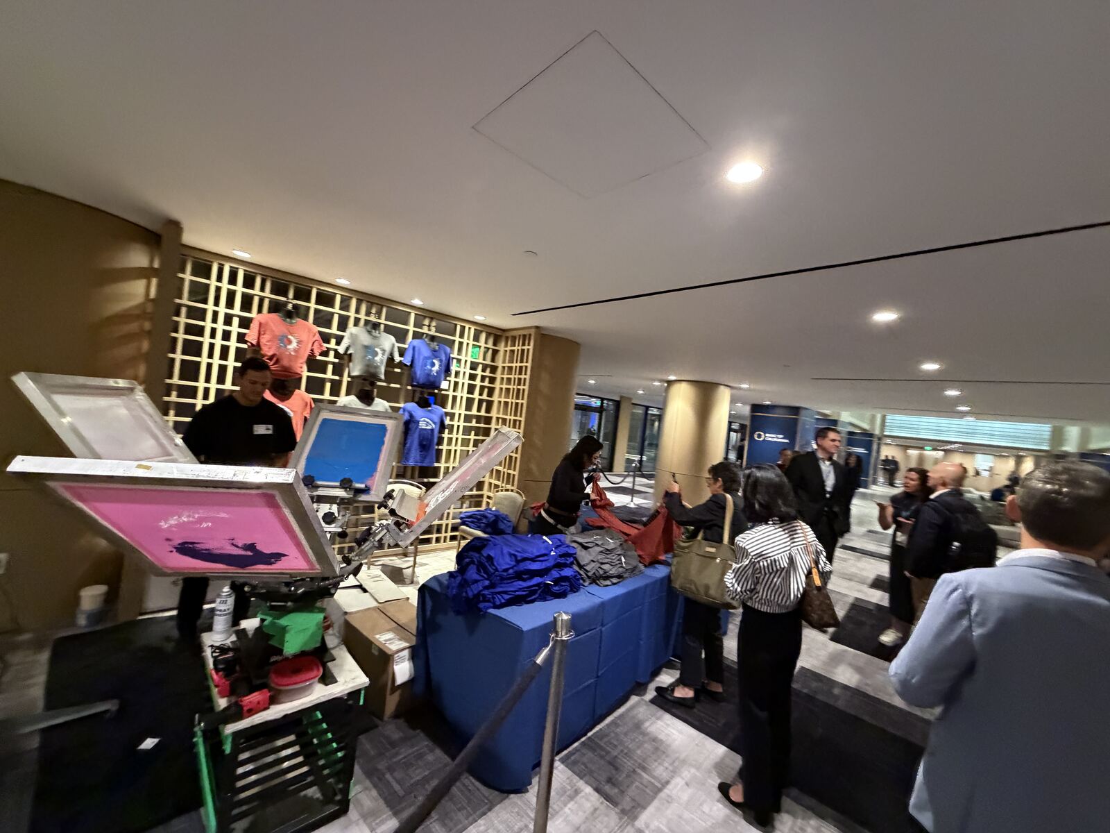
A merch booth is a small retail store you build twice a year, run for six hours, then throw in a truck. Everything that matters about it — whether people stop, whether they find their size, whether the line reads as exciting or as a wall — is decided by layout, not product.
Good merch booth layout, shelving and display design comes down to a few unglamorous decisions made in the right order. Here is the order.
Design for the direction people arrive from
Before anything gets drawn, find out how the crowd moves. One dominant flow past your booth, or traffic from both ends? Is there a stage, a bar or a bathroom setting the direction? At festivals, foot traffic surges in waves between sets. At trade shows it flows toward the far end of the hall in the morning and back in the afternoon.
The answer changes the whole plan. If traffic is one-directional, the hero display goes on the upstream corner — people should see your best piece before they are level with the booth, not after passing it. If it is bidirectional, you need a readable face at both ends, which usually means trading depth for frontage.
Get an updated floor plan from the organiser rather than working from last year’s. Neighbouring booths, a repositioned entrance or a new food row can invert the flow entirely.
Once you know the direction, zone the space. Every merch booth that works has the same four zones, and the failures are almost always two of them collapsing into one.
- Browse. Open, walk-in, no counter in the way. Where people decide.
- Transact. One clear point of payment or order intake, visible from the browse zone.
- Produce. Press, operator, blanks. Visible, not touchable.
- Collect. A separate handoff point for finished pieces.
Combining transact and collect is the classic error: the person paying and the person waiting occupy the same square metre, and the queue backs into the browse zone until nobody new can enter. Separating them by even six feet fixes it. Our guide to planning a festival merch booth covers the staffing behind these zones.
Build for eye level and for fifty feet
You are designing for two viewing distances at once, and they want opposite things.
At fifty feet, all anyone processes is a shape, a colour and a word. That is your top sign — big type, high contrast, one message, mounted above head height so it clears the crowd. Anything smaller than a few inches tall is invisible at that range.
At three feet, people read product. Roughly four to six feet off the ground is where your best merchandise goes, because that is where eyes rest without effort. Below knee height is stock and pack-out bins, not anything you want sold. Above seven feet is signage only, and only where it does not block the sightline into your own booth — a solid wall of high shelving reads as closed from the aisle.
Light the merchandise, not the crowd. Two clamp lights aimed at a garment wall do more for perceived quality than any fixture upgrade.
Shelving, racks and what actually survives a load-out
Fixture choice is a durability question as much as an aesthetic one. Gridwall and slatwall panels are the workhorses: they take shelves, hooks and faceouts, break down flat, and survive being loaded into a truck repeatedly. Freestanding retail shelving looks better and travels badly.
A few rules hold across formats. Stack folded tees in a single size run, largest at the bottom, with the size on a card at the edge of each stack so guests find their size without asking. Use faceouts only for the pieces you most want photographed. Put risers on the counter; a flat table of merchandise reads as a jumble from four feet away.
Weight it all down. Gridwall with an unweighted base and a tall sign is a sail, and outdoor booths lose fixtures to wind every season. Sandbags at every upright, and zip-tie the panels together so the assembly is rigid.
Route the press, the heat and the cable
Live printing changes the layout in ways a pure retail booth never worries about. Each heat press wants a dedicated 20-amp circuit, so you need to know where the power drops land before you place the press. Order electrical early; venues discount advance orders heavily and charge painfully at the door.
A press throws real heat. Do not put it where guests brush past it, do not put it under low fabric draping, and do not aim the operator’s back at the aisle. Let the work table form a hard perimeter, so the equipment is visible from three feet and reachable from none.
Cable is a trip hazard and a citation risk. Run everything along the back and side walls, tape or ramp anything crossing a walkway, and never route power through the browse zone. A hat bar running 30–45 pieces an hour has people moving around it constantly, and every one of them is looking at the press instead of the floor.
Making a small footprint work
Most booths are 10 by 10, which is not much once a press and a table are in it. Concede the depth and use the perimeter: garment wall on the back, press and work table along one side, intake counter pulled back from the aisle at a 45-degree angle on the open corner. That angle is the single best trick in a small booth — it opens the entry, gives the staffer a sightline down the aisle, and creates a natural queue line along the outside edge rather than through the middle.
Keep three feet of genuinely clear floor inside. If two staff cannot pass each other without turning sideways, the booth feels chaotic by hour two no matter how good the fixtures are. When space is the binding constraint, cut product variety before you cut circulation. Our comparison of renting versus buying a booth is worth reading before you commit to fixtures you then have to store.
Frequently asked questions
How much space does a live printing station need inside a merch booth?
Plan on roughly 8 by 8 feet for a single press station once you account for the press, a work table, a garment staging area and room for the operator to move. That is the working footprint, not the equipment footprint. Squeezing it smaller does not save space, it just slows the operator down.
Should the printer be at the front of the booth or the back?
Front third, angled so passers-by see the press cycle, but never directly against the aisle. The press is your best advertising and your worst traffic obstacle at the same time. Set it where people can watch from outside the booth without needing to enter and stand still.
What is the most common booth layout mistake?
Building a straight counter across the front. It reads as a barrier, forces every interaction to happen in the aisle, and gives you nowhere to put a queue. Break the front open, pull the counter back and to one side, and let people walk in.
Rent the booth and the layout together
Merch Troop delivers the fixtures, the displays, the presses and the crew as one package, laid out for your specific footprint and traffic direction. Send your booth dimensions and floor plan through the quote form or call (562) 614-4800 and we will sketch it against your space.
Reserve your dates
Ready to book a booth?
Send your event details and we’ll turn this guide into a real booth plan and quote.
- Delivery, setup, and teardown handled by our crew
- Full-color live printing on apparel and hard goods
- Trained staff who keep the line moving